Full platform migration from Wix to Shopify for a Danish nautical e-commerce — 5,000+ products, mobile-first UX redesign, eBay Italy integration, and social media content strategy.
Strategy
Started with a full UX audit of the Wix store — mapping user journeys, identifying friction points in navigation and checkout, and benchmarking against leading nautical e-commerce stores in Northern Europe. Built a phased migration plan to avoid disrupting live sales during the rebuild.
Design
Redesigned the information architecture from scratch — new product taxonomy, filters, and category structure optimised for 5,000+ SKUs. Built a clean visual system on Shopify with clear hierarchy, consistent product cards, and a streamlined checkout flow designed mobile-first.
User Experience
Optimised the full purchase funnel with a focus on reducing cart abandonment on mobile devices. Improved product discovery through smart filtering and internal search. Integrated eBay Italy as a second channel, and created social media templates to maintain brand consistency across all touchpoints.
Move Marine was running their catalogue of over 5,000 nautical products on Wix — a platform that couldn’t scale with the complexity of their inventory (marine electronics, GPS, radar systems) or the expectations of international buyers. The site was slow, navigation was flat, and the mobile checkout had a high abandonment rate.
The challenge wasn’t just a migration — it required a complete rethinking of the information architecture, product taxonomy, and user flow from discovery through to purchase. In parallel, I integrated the catalogue on eBay Italy to build a second sales channel, and took over social media to align the brand communication with the new UX direction.
Screen OneScreen Two
Product Photography
Every product in the Move Marine catalogue was photographed with 4 to 5 images from different angles — clean, consistent shots designed to build trust and reduce returns. With over 5,000 nautical products ranging from GPS systems to marine radar, visual quality was essential to convert international buyers who cannot physically inspect the items before purchasing.
Payments & Checkout The store was configured to handle both Italian and Scandinavian buyers. Payment methods include Stripe for international card payments and Shipmondo for Scandinavian-native payment flows — a critical detail for the Danish and Nordic market where local payment habits differ significantly from Southern Europe. The checkout was designed mobile-first to reduce abandonment and adapt to each market’s expectations.
Shipping & Logistics
International shipping was managed through three major carriers: UPS, PostNord, and FedEx — covering Europe and beyond. PostNord handles Scandinavian domestic and Nordic region deliveries, UPS covers EU and international shipments, and FedEx supports express and intercontinental orders. Each carrier was integrated directly into the Shopify checkout with live rate calculation and automated tracking notifications for customers.
“Enrico demonstrated exceptional skills in WooCommerce integration, SEO, email marketing, and design aesthetics. His knowledge played a crucial role in enhancing our e-commerce platform, resulting in improved functionality and a seamless shopping experience for our customers.”
Martin Cernic CEO · Move Marine ApS · Copenhagen, Denmark
Genitori di Cuore’s website hadn’t been meaningfully touched in over a decade. There was no real design system or visual hierarchy — sections felt mixed with no clear flow. Photography dated back to the early 2000s. Pages lacked proper descriptions and copy, and the site had never been optimised for search. Digging into the backend surfaced the technical side of that neglect too: over 30 old header templates and page versions layered on top of each other from years of edits, causing visual bugs like a duplicated logo/menu and a leftover “COVID-19 update” banner still live years after the pandemic.
Strategy
Full visual redesign of the site on WordPress/Elementor — introducing an actual design structure and hierarchy where there had been none, and cleaning up over 30 overlapping legacy header templates down to a single, maintainable source of truth.
Design
Redesigned the visual identity with current, on-brand photography replacing imagery from the early 2000s. Removed leftover technical debt causing visual bugs — a duplicated header and a years-old COVID-19 notification banner still live on the site.
User Experience
Rewrote content from scratch across key pages — clear descriptions and copy where there had been little to none — and improved on-page SEO so the association’s mission and family support programs are finally discoverable and properly communicated.
The project involved a complete visual redesign and rewrite of the site’s content from the ground up, alongside a full technical cleanup of the WordPress backend to bring the header structure down to a single, maintainable template and restore proper site hygiene.
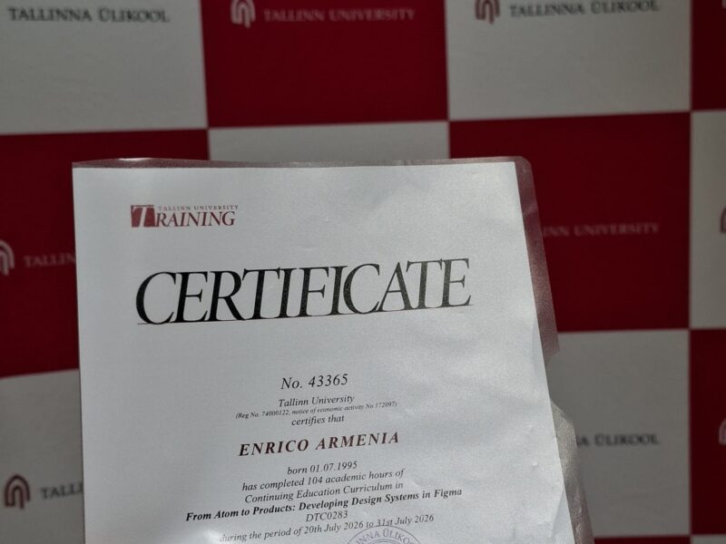
In July 2026 I attended an intensive summer school at Tallinn University focused on building scalable, component-based design systems in Figma — from atomic tokens to full product patterns. I used the course as an opportunity to apply the methodology directly to Path Abroad, my own EU mobility consulting project, turning coursework into a real, reusable design system.
Strategy
Rather than working with a generic training brief, I anchored every exercise to a live project — Path Abroad, my international mobility consulting service. This meant every token, component, and layout decision had to hold up against a real use case, not just a classroom exercise.
Design
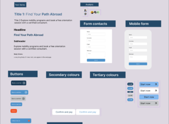
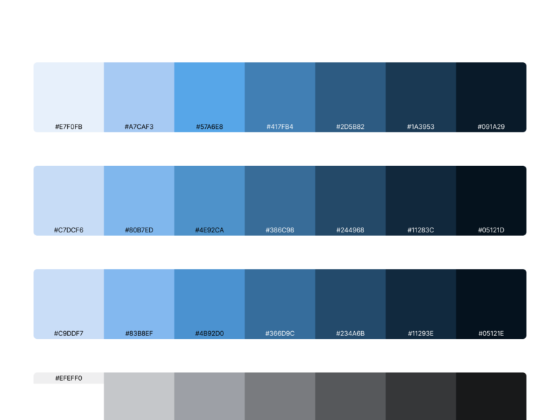
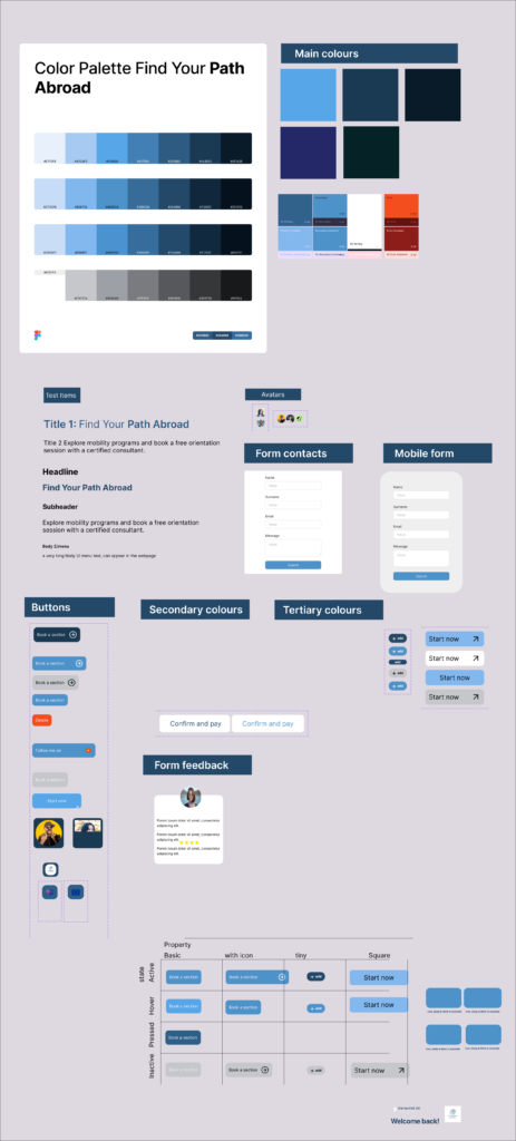
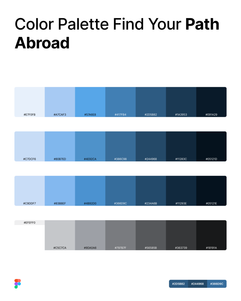
Starting from the Path Abroad brand mark, I built a full color token system in Figma using semantic naming (color/primary, color/bg-surface, color/text-secondary) instead of raw values — with #2D5B82 as the primary blue, plus a supporting scale of light blues, whites, and greys. I extended this into a typography scale, spacing tokens, an icon set, and a 12-column grid, all set up as W3C-compliant Figma variables so they could be exported and reused across other tools via Tokens Studio.
Meta box
Program Tallinn Summer School — “From Atom to Products: Developing Design Systems in Figma” Date July 2026 Location Tallinn University, Estonia 🇪🇪 Tools Figma, Tokens Studio, W3C Design Tokens Role Participant / UX Designer
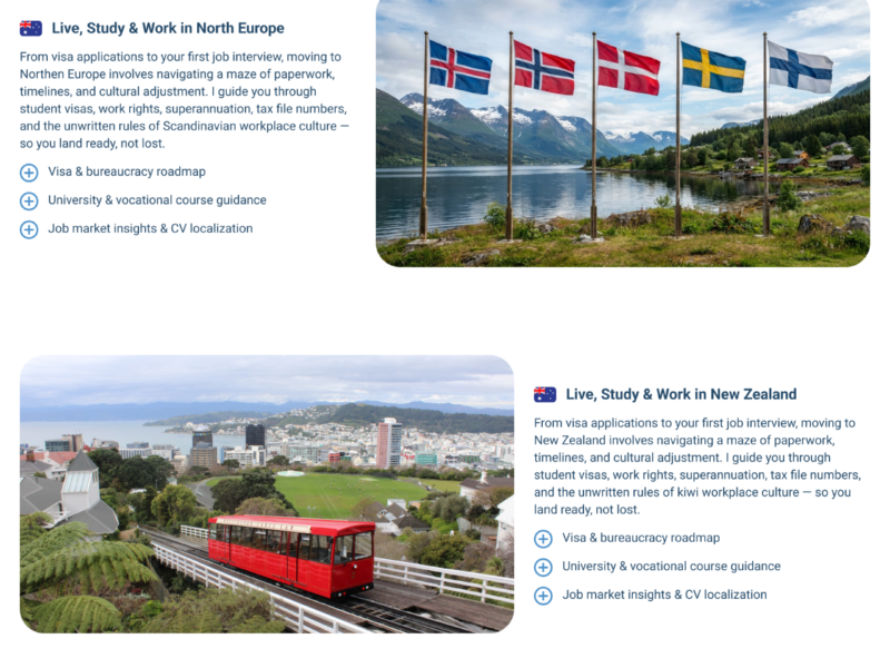
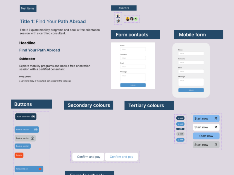
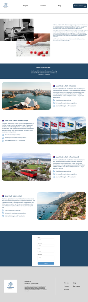
Following atomic design methodology, I moved from base atoms (colour, type, spacing, icons) to components (buttons, badges, form fields) and finally applied the full token set to two real prototype screens for Path Abroad: the homepage and the “About + Destinations” page, covering Australia, Northern Europe, New Zealand, and Italy. Every colour, button state, and icon on these screens comes directly from the token library rather than one-off values — proof that the system holds up across full, content-heavy layouts, not just isolated components.
Outcome
The result is a working, documented design system I can keep extending as Path Abroad grows — and two fully designed prototype pages that put it to the test. It’s a concrete example of how my UX/UI skills and my EU mobility consulting work reinforce each other: I don’t just advise on international careers, I build the digital tools that support them.
Tallinn also gave me a first-hand look at Estonia’s startup ecosystem — from Lift99 to e-Residency — feeding directly into the research behind Path Abroad’s Northern Europe positioning.